How does an expert in any field predict outcomes with high confidence?
The answer seems obvious: experience. But what exactly is experience? It’s an unconscious statistical model built through repeated observation. A doctor sees symptoms and predicts diagnoses. A real estate agent sees location and square footage and estimates price. Their intuition is pattern recognition refined over thousands of examples.
This ability isn’t exclusive to experts. We all build informal predictive models constantly in our heads. We see thick clouds and expect rain. We notice an apartment’s size and location and guess its cost.
Let’s make a playful summer example that we will use to introduce more concepts and step by step get closer to linear regression which is the subject of this blog post.
Imagine we run a small experiment: each day we note the average temperature, we ask a group of people how many ice creams they bought (then we calculate the quantity in cL of how much they consumed), and we measure their “sunburn index” on a scale from 0 to 10 (where 0 means no redness at all, and 10 means very strong sunburn, measured with a handheld erythema device). And we can see the results in the following table:
| day | temperature (°C) | sunburn index (0–10) | ice creams (cl) |
|---|---|---|---|
| 1 | 18.0 | 0.50 | 28 |
| 2 | 20.0 | 1.19 | 39 |
| 3 | 22.0 | 2.52 | 45 |
| 4 | 24.0 | 3.58 | 49 |
| 5 | 26.0 | 4.10 | 61 |
| 6 | 28.0 | 5.29 | 65 |
| 7 | 30.0 | 6.63 | 79 |
| 8 | 31.0 | 7.09 | 80 |
| 9 | 32.0 | 7.70 | 83 |
| 10 | 33.0 | 8.10 | 86 |
| 11 | 34.0 | 8.96 | 96 |
| 12 | 35.0 | 9.50 | 96 |
We can see that on hotter days, both ice cream sales and sunburn intensity increase. Another very interesting thing is that you could also probably predict ice cream consumption reasonably well just by looking at the sunburn index, without even knowing the temperature. Why? Because sunburn and ice cream sales tell similar stories. They move together because they share a common driver which is temperature.
Tables are hard to parse visually, so let’s plot the relationship:
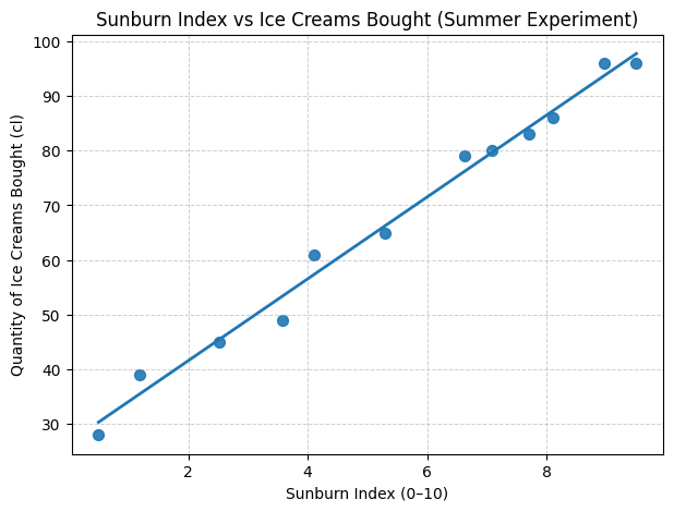
Does eating ice cream cause sunburn? Do sunburned people crave more ice cream? Of course not. What we’re seeing here is correlation, which is the tendency of two variables to move together. When sunburn is above its typical level, ice cream consumption tends to be above its typical level too. When one is low, the other tends to be low. This “togetherness” is what correlation captures, though it says nothing about causation (if one is the cause of the other). Both variables are simply responding to the same underlying factor: temperature.
The formal mathematical definition of correlation will come soon. To get there, we need to build it from the ground up.
The first thing we need is a notion of what’s typical. For each variable, we take the average, the mean, over all days. This number is our baseline.
For sunburn \((x)\) and ice cream \((y)\) we calculate:
\[\bar{x} = \frac{1}{n}\sum_{i=1}^n x_i = 5.43, \quad \bar{y} = \frac{1}{n}\sum_{i=1}^n y_i = 67.25\]Now that we know the typical level, we can ask: how much does each day differ from it? For the first day (day 1 in the table, which is the first line):
\[x_1 - \bar{x} = 0.5 - 5.43 = -4.93, \quad y_1 - \bar{y} = 28 - 67.25 = −39.25\]So both variables are below their usual level on day 1.
How can we know whether they are moving in the same direction? (are they increasing or decreasing together) We multiply the deviations and simply check their sign:
\[(x_1 - \bar{x})(y_1 - \bar{y}) = (-4.93)(−39.25) = 193.5025\]The product is positive, which means both were below their average together. If one had been above while the other below, the product would be negative.
Let’s check another day: day 12, where sunburn = (9.5) and ice cream = (96). Deviations:
\[9.5 - 5.43 = +4.07, \quad 96 - 67.25 = +28.75\]Multiply:
\[(+4.07)(+28.75) = +117.0125\]Again positive, so they are both above average that day.
Doing this multiplication for just one day or two is not meaningful. What we want is the overall pattern: do they tend to move together across the whole dataset? So we sum up all those products across days, and then average them:
\[\operatorname{Cov}(x,y) = \frac{1}{n-1}\sum_{i=1}^n (x_i - \bar{x})(y_i - \bar{y})\]This number is called the covariance. If it’s strongly positive, then when sunburn is above its average, ice cream is usually above its average too (and the same when they are both below). If it’s strongly negative, they tend to move in opposite directions. If it’s close to zero, they move independently, without a linear relationship.
Let’s continue our previous calculations to have a clear image: \(\begin{aligned} \text{Given }& n=12,\quad \bar{x}=\frac{1}{12}\sum_{i=1}^{12} x_i = 5.43,\quad \bar{y}=\frac{1}{12}\sum_{i=1}^{12} y_i = 67.25.\\[6pt] \operatorname{Cov}(x,y) &= \frac{1}{n-1}\sum_{i=1}^{n} (x_i - \bar{x})(y_i - \bar{y})\\[4pt] &= \frac{1}{11}\Big[ (0.50-5.43)(28-67.25) +(1.19-5.43)(39-67.25)\\ &\qquad\quad +(2.52-5.43)(45-67.25) +(3.58-5.43)(49-67.25)\\ &\qquad\quad +(4.10-5.43)(61-67.25) +(5.29-5.43)(65-67.25)\\ &\qquad\quad +(6.63-5.43)(79-67.25) +(7.09-5.43)(80-67.25)\\ &\qquad\quad +(7.70-5.43)(83-67.25) +(8.10-5.43)(86-67.25)\\ &\qquad\quad +(8.96-5.43)(96-67.25) +(9.50-5.43)(96-67.25) \Big]\\[6pt] &= \frac{1}{11}\Big[ (-4.93)(-39.25) +(-4.24)(-28.25) +(-2.91)(-22.25) +(-1.85)(-18.25)\\ &\qquad\quad +(-1.33)(-6.25) +(-0.14)(-2.25) +(1.20)(11.75) +(1.66)(12.75)\\ &\qquad\quad +(2.27)(15.75) +(2.67)(18.75) +(3.53)(28.75) +(4.07)(28.75) \Big]\\[6pt] &= \frac{1}{11}\Big[ 193.5025 +119.78 +64.7475 +33.7625 +8.3125 +0.3150\\ &\qquad\quad +14.10 +21.165 +35.7525 +50.0625 +101.4875 +117.0125 \Big]\\[6pt] &= \frac{1}{11}\times 760.0000\\[4pt] &= 69.0909 \;\;(\approx 69.09). \end{aligned}\)
Why do we divide by \((n-1)\) instead of just summing? Because we want an average measure, not one that grows just because we added more days. Dividing makes the quantity independent of the number of observations, so we can compare across datasets of different sizes. The (n-1) instead of (n) is a statistical adjustment: it corrects a small bias because we estimated the mean from the same data (this is called Bessel’s correction). In practice, just think of it as “we want the fair average co-movement per day.”
At this point, you might wonder: what does 69.09 actually mean? The covariance has strange units: sunburn-index × centiliters, which isn’t a physical quantity we can interpret, we can’t also quantify using covariance how much the two variables are related to each other. Worse, if we measured ice cream in milliliters instead of centiliters, the covariance would be 10 times larger (690.9), even though the relationship between the variables hasn’t changed at all. This scale-dependence is a problem. What we need is a pure, unitless number that measures relationship strength regardless of measurement units (aka a quantity that directly give us if two variables are related and how much are they). That’s where we really need correlation, which is just the normalized version of covariance.
Of course. Your article is flowing beautifully. The transition from covariance to the need for normalization is perfect. This is the ideal moment to introduce standard deviation as the tool for that normalization.
But what does it mean to “normalize” the covariance?
To normalize the joint movement of two variables, we first need a standard way to measure the individual movement of each one by itself. Think about it: the number 69.09 seems large, but is it large relative to how much these variables typically wiggle on their own? If both sunburn and ice cream sales are incredibly volatile, their co-movement might be less impressive. If they are very stable, that same co-movement is highly significant.
So, let’s pause our two-variable problem and solve a simpler one first: How do we calculate a single number that represents the typical spread or “wobbliness” of one variable?
Let’s just focus on ice cream sales \((y)\). We know the average is \(ȳ = 67.25\) cL. We also have the list of daily deviations from this average: \((yᵢ - ȳ)\). How can we find the average deviation?
This should feel familiar. If we just sum the deviations, the positive and negative values will cancel each other out, telling us nothing. To solve this, we use the same trick as before: we square each deviation to make them all positive.
\[(y_i - \bar{y})^2\]Now, let’s find the average of these squared deviations. This gives us a robust measure of the average “squared spread” of the data. This quantity has a famous name: the Variance.
\[\operatorname{Var}(y) = s_y^2 = \frac{1}{n-1}\sum_{i=1}^n (y_i - \bar{y})^2\]The variance is a perfectly valid measure of spread, but it has one nagging problem: its units are weird. Since we squared the deviations (in centiliters), the variance is measured in centiliters squared. What is a “squared centiliter”? It’s not intuitive.
To get back to our original, interpretable units, we simply undo the squaring operation. We take the square root of the variance.
This final number—the square root of the average squared deviation—is the Standard Deviation. It is the single most important measure of spread in all of statistics. It represents the typical distance of any given data point from the average.
\[s_y = \sqrt{\frac{1}{n-1}\sum_{i=1}^n (y_i - \bar{y})^2}\]Let’s calculate the standard deviation for both of our variables:
For sunburn index (\(x\)): \(s_x = \sqrt{\frac{1}{11}\sum_{i=1}^{12} (x_i - 5.43)^2} = \sqrt{8.54} \approx 2.92\)
For ice cream sales (\(y\)): \(s_y = \sqrt{\frac{1}{11}\sum_{i=1}^{12} (y_i - 67.25)^2} = \sqrt{538.21} \approx 23.20\)
Now we have numbers we can actually interpret. A standard deviation of \(s_x = 2.92\) means that on a typical day, the sunburn index was about 2.92 points above or below the average of 5.43. A standard deviation of \(s_y = 23.20\) cL means that on a typical day, ice cream sales were about 23.20 cL above or below the average of 67.25 cL.
We have now built our essential tools. We have:
- A measure of joint movement: Covariance.
- A standard ruler for the individual movement of each variable: Standard Deviation.
Our problem with covariance was that its value (\(69.09\)) was uninterpretable without context. Is \(69.09\) a lot or a little? It depends on the natural “wobbliness” of the variables themselves.
The standard deviation gives us the perfect context. It tells us the size of a typical deviation for each variable.
- A typical deviation for sunburn \((x)\) is \(s_x = 2.92\).
- A typical deviation for ice cream \((y)\) is \(s_y = 23.20\).
What would be the “benchmark” for a typical amount of joint movement? A natural choice is the product of their typical individual movements:
\[s_x \times s_y = 2.92 \times 23.20 = 67.744\]This number, \(67.744\), represents a baseline for the expected magnitude of co-deviation, given the inherent volatility of our two variables. It has the same weird units as our covariance (\(sunburn-index × centiliters\)), making it the perfect yardstick for comparison.
The logic is now simple. To find out how strong our observed co-movement is, we can express it as a ratio of this benchmark:
\[\text{Strength} = \frac{\text{Actual Average Joint Movement}}{\text{Benchmark for a Typical Joint Movement}} = \frac{\operatorname{Cov}(x,y)}{s_x s_y}\]This simple division is the masterstroke. It “divides out” the units and the scale of the individual variables, leaving behind a pure, normalized number. This number is the Pearson Correlation Coefficient, denoted by the letter \(r\).
\[r = \frac{\operatorname{Cov}(x,y)}{s_x s_y}\]Let’s calculate it for our data:
\[r = \frac{69.09}{2.92 \times 23.20} = \frac{69.09}{67.744} \approx 0.989\]This final number, \(0.989\), is the answer we’ve been looking for. It is packed with meaning:
- It is unitless: It’s a pure measure of strength. It wouldn’t matter if we measured ice cream in gallons or sunburn on a 100-point scale; the correlation would be the same.
- It has a fixed range: The correlation coefficient \(r\) is always bounded between -1 and +1.
- +1 indicates a perfect positive linear relationship. As one variable goes up, the other goes up in perfect lockstep.
- -1 indicates a perfect negative linear relationship. As one goes up, the other goes down in perfect lockstep.
- 0 indicates no linear relationship at all. The variables move independently.
- It is interpretable: Our result of \(0.989\) is extremely close to +1. This gives us a precise, mathematical confirmation of what our eyes saw in the plot: there is a very strong, positive linear relationship between the sunburn index and ice cream sales in our data.
We have successfully moved from a vague intuition about a pattern to a single, powerful number that quantifies it. By confirming the existence of such a strong linear relationship, we have earned the right to ask the next, most important question: Can we build a model that uses this relationship to make predictions?
This is the question that leads us directly into the world of linear regression.